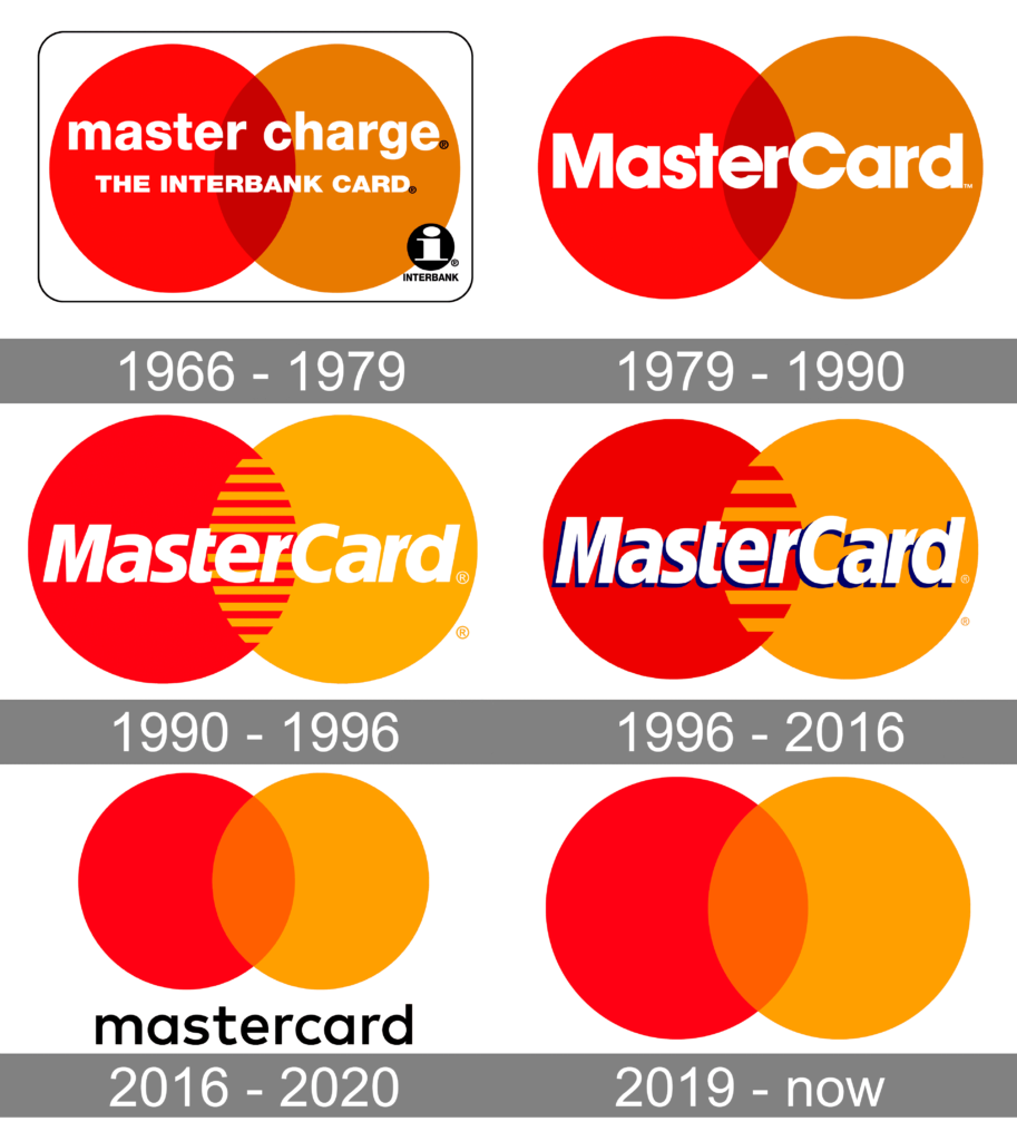
The trend of oversimplification has received a mass of negative feedback. However, in some cases, the simplification of once heavily designed logos does it justice instead of harm. For example, take Mastercard; what was once a logo that was obscured by text in the middle is now a simple venn-diagram. The logo itself is still recognizable regardless, and many responded positively to this change due to it being less distracting and easier to process, rather than the complicated version that existed once before.

A timeline featuring the evolution of Mastercard’s logo across the decades.